


Wise & Uber
A blend experiment 👀

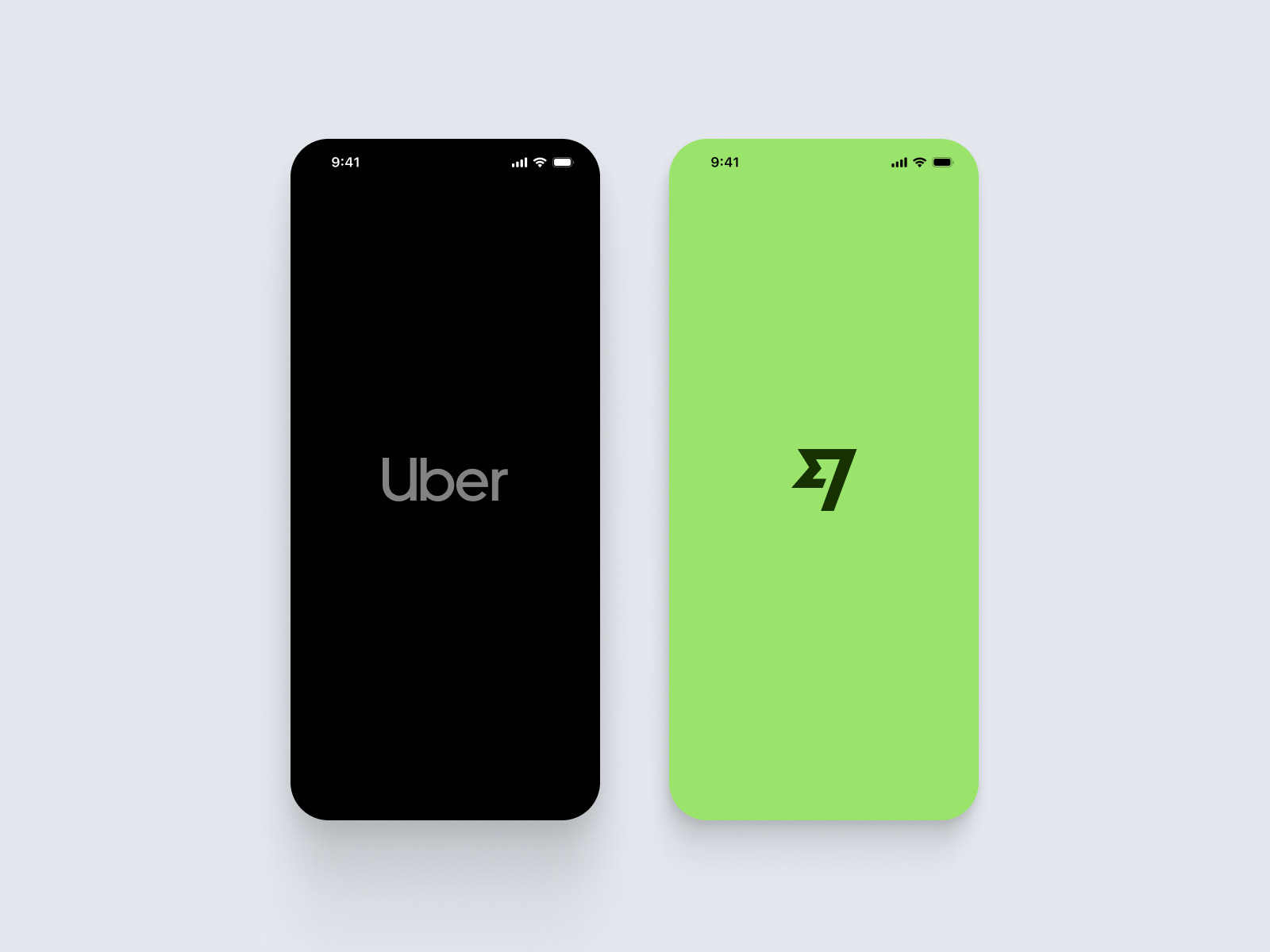
→ Brands
I Choose Wise bc its a clean and intuitive financial app design, and Uber for its a seamless and dynamic transportation platform.
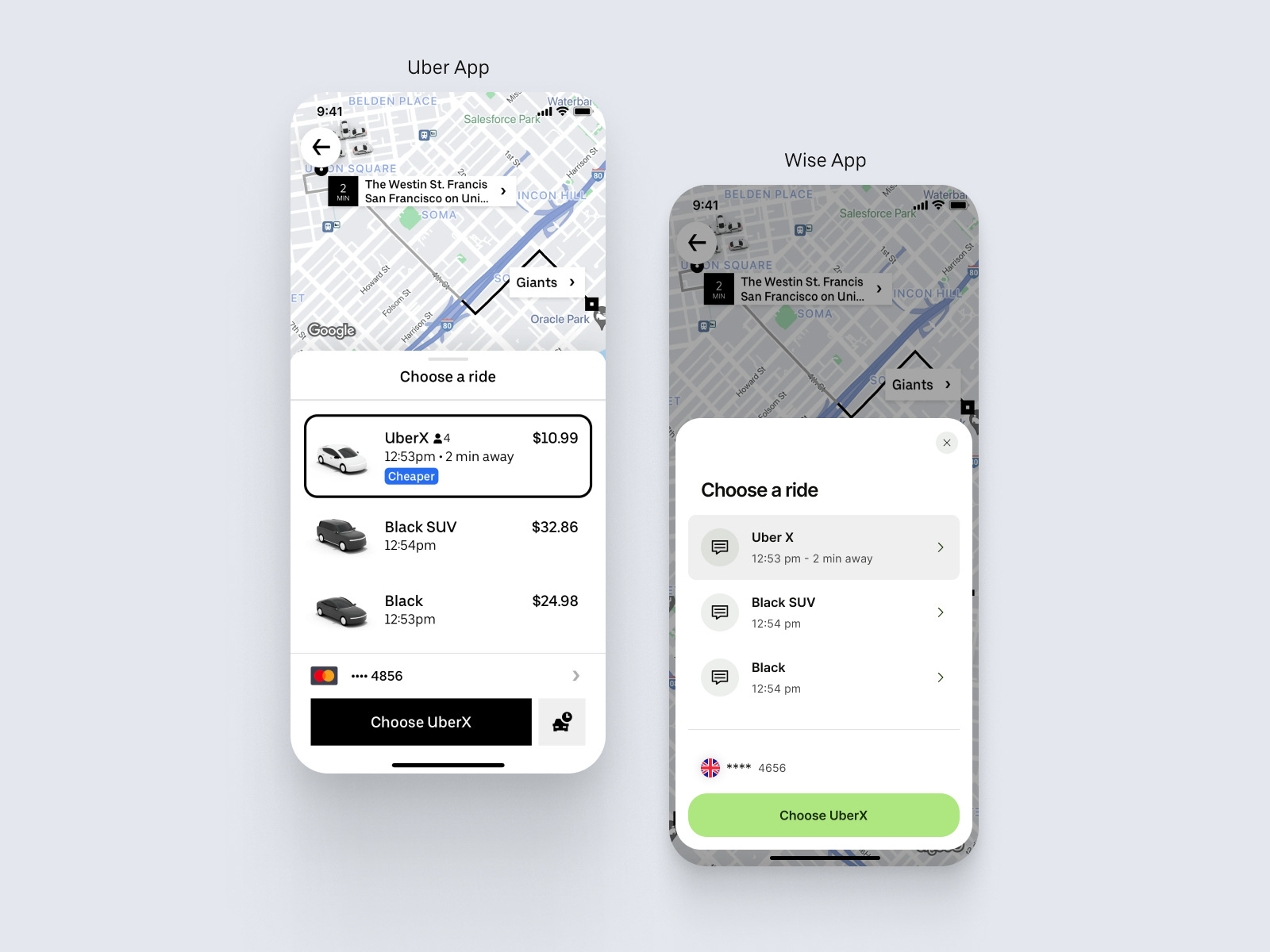
→ Process
Identify foundations like typography, colours, border radius, variants.
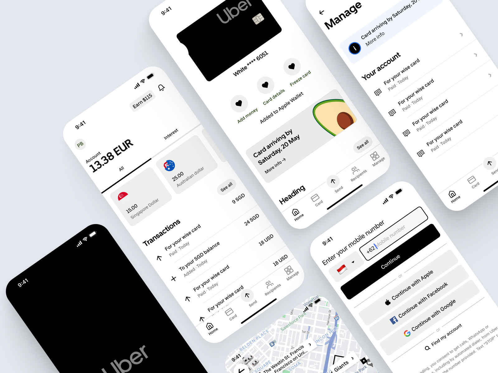
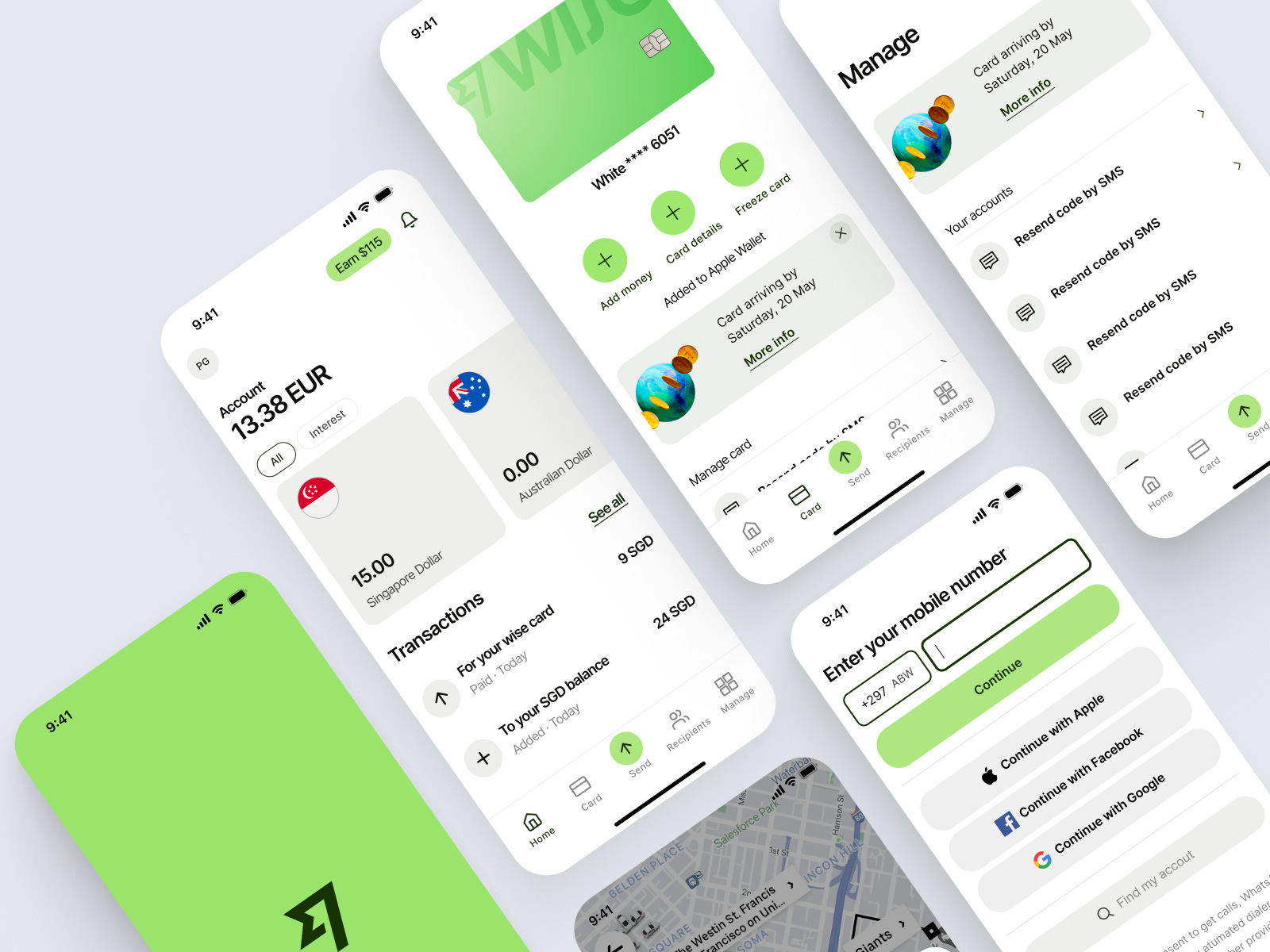
→ Design Fusion
Typography seamlessly blends Wise's clarity with Uber's dynamism. Colors merge Uber's sleek greyscale with Wise's vibrant green, striking a balance between accesibility and energy.
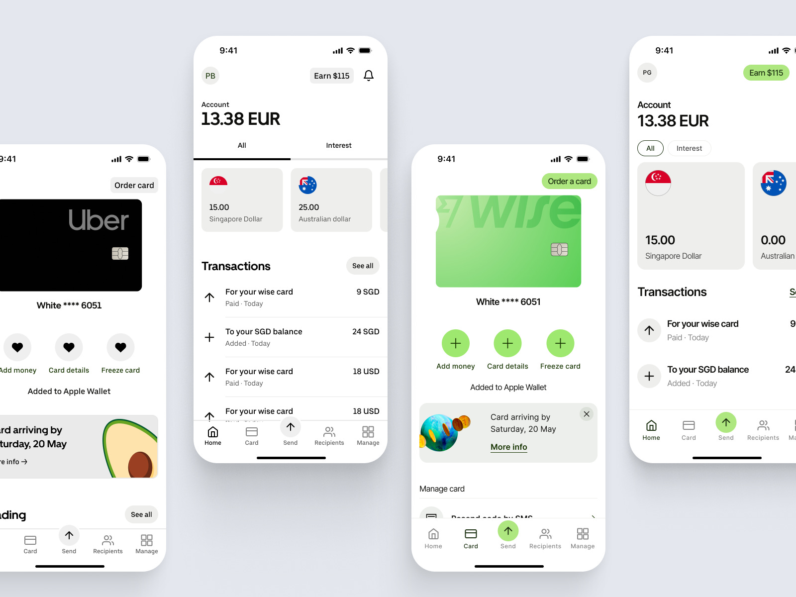
→ Accent Impact
Wise's green accent in a sea of greyscale acts as a guiding light.
Which brand do you prefer?